Sure, we just had a post on common design mistakes, but there are more than enough to justify one more post — or a dozen.
But seriously. Design is such a critical piece of the survey development process, both from strategic and technical perspectives, that brushing up on best practices never hurts. To take your next project to the next level, add the mistakes below to the first five and you’ll have a list of the top ten most common design mistakes.
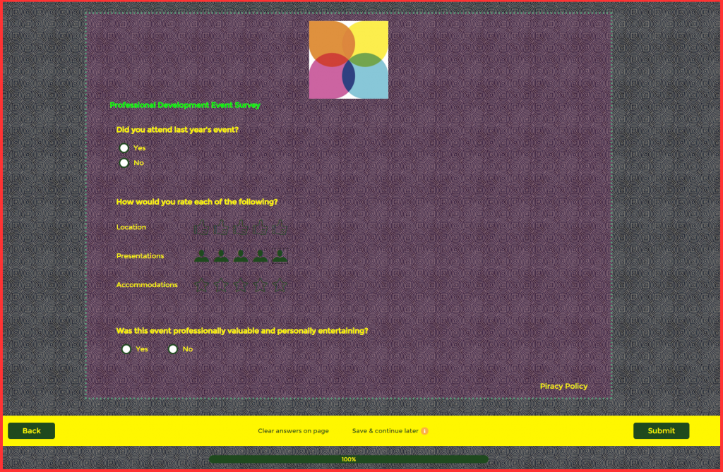
Mistake 6: It just looks bad.
From a visual perspective, the perfect survey is clear, polished, and on-brand. A hard-to-read survey is inaccessible and unlikely to collect meaningful results. An ugly survey is just bad news all around. The survey’s appearance should be customized to match your company or project logo, and if you’re sending an invitation, your invitation should match your survey. Backgrounds and borders, colors and fonts, transparency and brightness — you have plenty of options to tweak up your visuals, but that also means plenty of opportunities to muck it up.
Do this: Check in with your design and marketing teams for the latest version of your official style guide, then create a Visual Settings template that you can use over and over again. Share the preview or test surveys with your team for review and suggestions. Also, upload an Account Logo that’s exactly the right size and resolution and use it consistently across your projects.

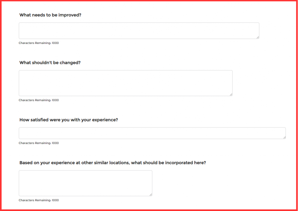
Mistake 7: There are too many open-ended questions.
Open-ended Text Box questions offer participants the opportunity to share their own original thoughts without being constrained by a limited set of answers. Despite having plenty of control over the dimensions and character count of each Text Box, survey designers often forget to exercise control over the number of Text Boxes included in a single project. While valuable, open-ended responses take participants more time to enter than answers to any other question type, and this can lead to early onset survey fatigue.
Do this: Review open-ended questions to see if any of them can be answered with a different question type, knowing that you might also include an ‘Other’ field where it’s impossible to guess all possible answers. Then, review the remaining Text Box questions to prioritize the most important. Be sure the language is clear and specific (“Please share any additional feedback regarding how we might improve our onboarding process.” rather than “Anything else?”) so you can get the most useful data from each response, and consider where each Text Box should appear in the larger survey structure. In general, Text Box questions work best late in the survey, after participants have had the chance to express themselves in more structured answers. That way, you’re not getting answers up front to a question you’ll ask directly later on, and your participants will already have considered the topic through the guided questions.

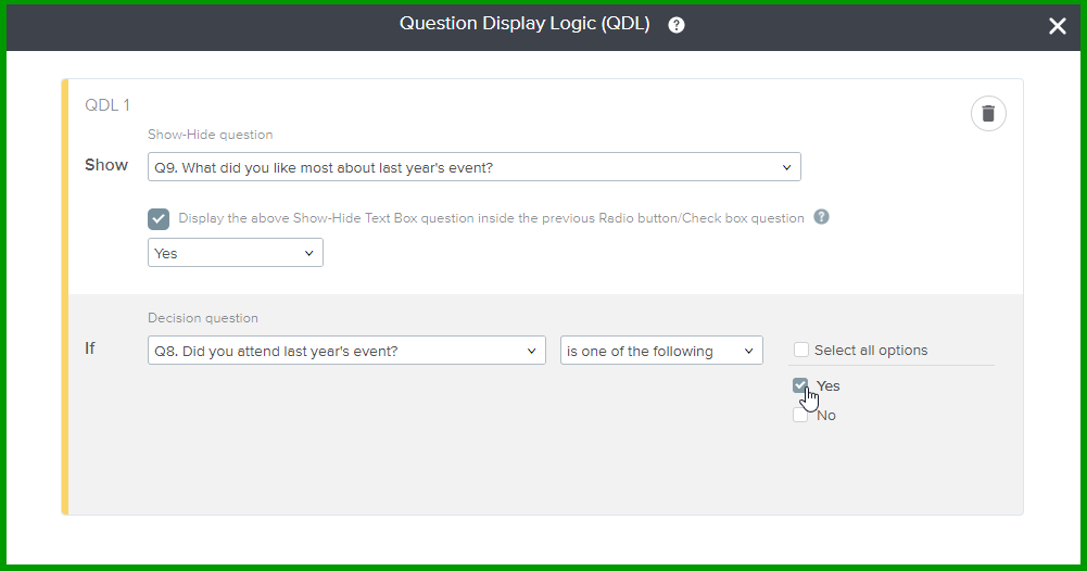
Mistake 8: Participants are asked irrelevant questions.
To use a classic example from our internal training: If you tell me that you don’t like ice cream at all, it doesn’t make sense for me to ask you which flavor is your favorite. Even if you are kind enough to answer the irrelevant question, your answer will be equally irrelevant and not worth collecting. For some reason, people don’t usually make this mistake in conversations, but they do it all the time in surveys. While a survey attempts to make a connection between the administrator and the participant, asking unanswerable questions widens the gap. For most of us, this experience is perceived as somewhere between annoying and disrespectful.
Do this: Use survey skip logic like Question Display Logic, Single-Question Branching, Multi-Question Branching, and IntelliMatrix to determine which participants are asked which questions. Set the right conditions so you’re only collecting data from those who can legitimately provide meaningful answers.

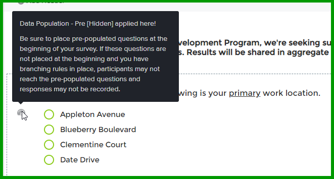
Mistake 9: Participants are asked for answers the administrator knows.
Even worse than having someone ask you an irrelevant question is having someone ask you a question to which they already know the answer. In trainings, I often demonstrate this with the pretty straightforward example of “Hi Melissa! What’s your name?” You’d never say this in conversation, so why do it in a survey? While irrelevant questions are annoying, asking for known questions always seems disrespectful. Imagine turning to someone you’ve worked beside for years and asking, “Wait, who are you again?” Nope. Don’t do it.
Do this: Use Pre-Population to pre-fill known answers. This shortens the survey experience for participants while also delivering useful data for your reports. For example, if you know you’ll want to segment employee survey results by department, pre-fill each employee’s department information and show, hide, or let them edit their answer.

Mistake 10: Question stems are double-barrelled or otherwise unclear.
Q: Was this post entertaining and useful? A: Yes/No
If you answer Yes, I can hope that you mean the post was both entertaining and useful. Hope. If you say No, though, does that mean it was useful but not entertaining, entertaining but useful, or neither entertaining or useful? No idea. Here’s another one:
Q: Are there enough training opportunities provided by the company, not including those run by specific departments, that you are able to function more effectively in your primary role and/or in additional secondary roles that you would not have to look anywhere else to not have to go without? A: What?
Somewhere between a double negative and a long and winding road, unclear questions are the worst. I think I’m asking one thing, but if you’re not on the exact same wavelength, it’s impossible to tell if your answers match up with my intended question.Therefore, of course, the results are useless.
Do this: Review your survey questions multiple times from that how-can-I-screw-this-up critical perspective, then ask your critical friends to do the same. Watch out for logical fallacies and double-dips like two part questions that can’t be reasonably addressed by a single answer.

From here, it’s up to you. Of course, we have plenty of resources, including survey design experts who can help walk you through your design decisions. All you have to do is ask the right questions. 🙂


