We’ve been sprinting and sprinting (yes, a super-fast development cycle — not actually running, thanks!) and our next batch of refinements and updates is already live. Phew! Want a quick recap?
- 30.1: Dynamic Contact Lists, smarter embedding in email invitations, Conditional Segment Display…
- 30.2: Rebrand from SoGoSurvey to Sogolytics!
- 30.3: Copying Rules & Alerts within projects and when copying projects, ‘Apply to all’ segmentation in Omni…
- 30.4: Introducing Answer Display Logic, page names, more CX Tags per category…
Before we dive in for a quick look at 30.5, the classic reminder: Features do vary by account type. Log in or drop a note to our support team with any questions.
More ADL, please!
- Add Answer Display Logic to all other single-select question types
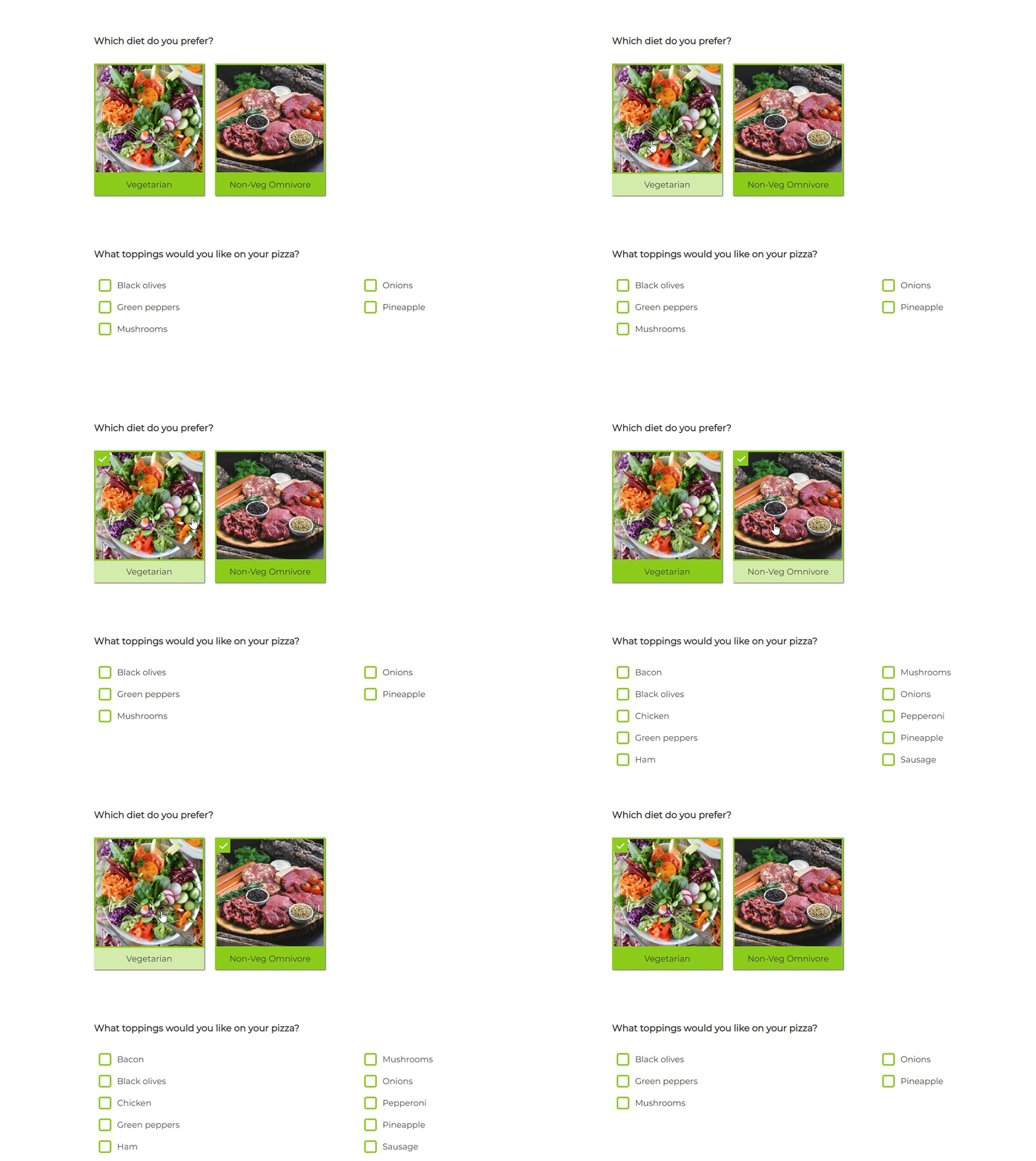
We’ve gotten lots of positive feedback on Answer Display Logic since it rolled out in the last sprint, as well as a few Wait, what? responses. We get it! The more logic, the better — and the more examples that help us to understand, the better! In this sprint, we’re rolling out Answer Display Logic for more question types to make it even more valuable, including Horizontal Radio Button, Rating Radio Button and Drop Down, Image Choice, and more. Haven’t tried it out yet? Let’s go with another example!
You’re in charge of ordering food for your team and you’d like to check in on their pizza topping preferences. Sure, you could just give a really long list of options, but get smart! You know that some of your colleagues are vegetarians and won’t choose any meat options. So, set up a diet preference question (Image Choice looks cooler!) and set Answer Display Logic to only display meat toppings to those who select the non-veg choice. Want to get extra fancy? Add Answer Constraints (Select up to three choices) to help participants focus and make your decisions easier.

Change number of answer options in Key Driver question
- Edit the total number of answers in Key Driver grids
Every conversation about “actionable insights” in SogoCX starts with CX metrics and leads to Key Drivers. What’s not to love? This is the magical combination that helps you to better understand which variables (wait time, availability, etc.) have the biggest impact on your target customer experience metrics (NPS, CSAT, CES) in a Key Driver Analysis report. Best! The simplicity of this question type makes for simple, powerful reporting, but we’ve heard you! We get that you want more flexibility, and it’s here! Here are two examples:
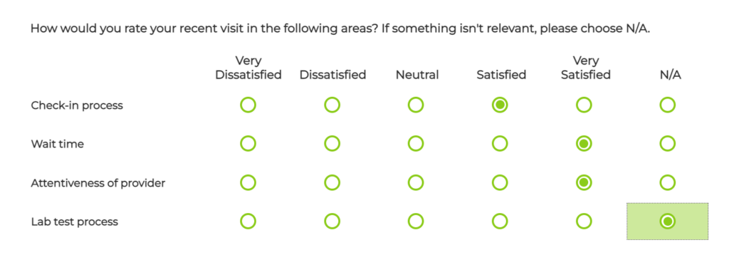
You’re a big fan of the 5-point scale, but there are a few items you’d like to include in the same grid that won’t be applicable to all of your participants. Simple enough! Add N/A to the end (or up front, if you prefer!), just like you would in other grid questions. Also: Whether you use N/A or some other label, be sure that you clarify the meaning and purpose of this answer option while introducing the question.

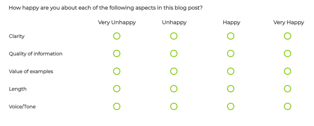
Here’s another example, for those who aren’t fans of the 5-point scale. Sure, “Neutral” might not be all that actionable, so if you want to draw a straight line down the middle of your rating scale and force participants to choose sides, do it! Here’s an example of a Key Driver revised to include a 4-point scale. Yes, it does look like a “normal” Rating Radio Grid, but accept no imitations! Even though they look the same to participants, Key Driver questions are THE BEST in quickly generating Key Driver Analysis reports (shocker, right?).

Report-level segmentation: Dynamic Comparison in NPS Trend
- Utilize Dynamic Comparison in NPS trend graph while applying Segmentation in Canvas
There’s probably something we love more than segmentation, but it’s really hard to think of at the moment. After all, how can you tell how “good” the news is if you have nothing to compare it to? The flexibility to apply segmentation in Omni is definitely a fan favorite, but we all know that nothing in tech is static…
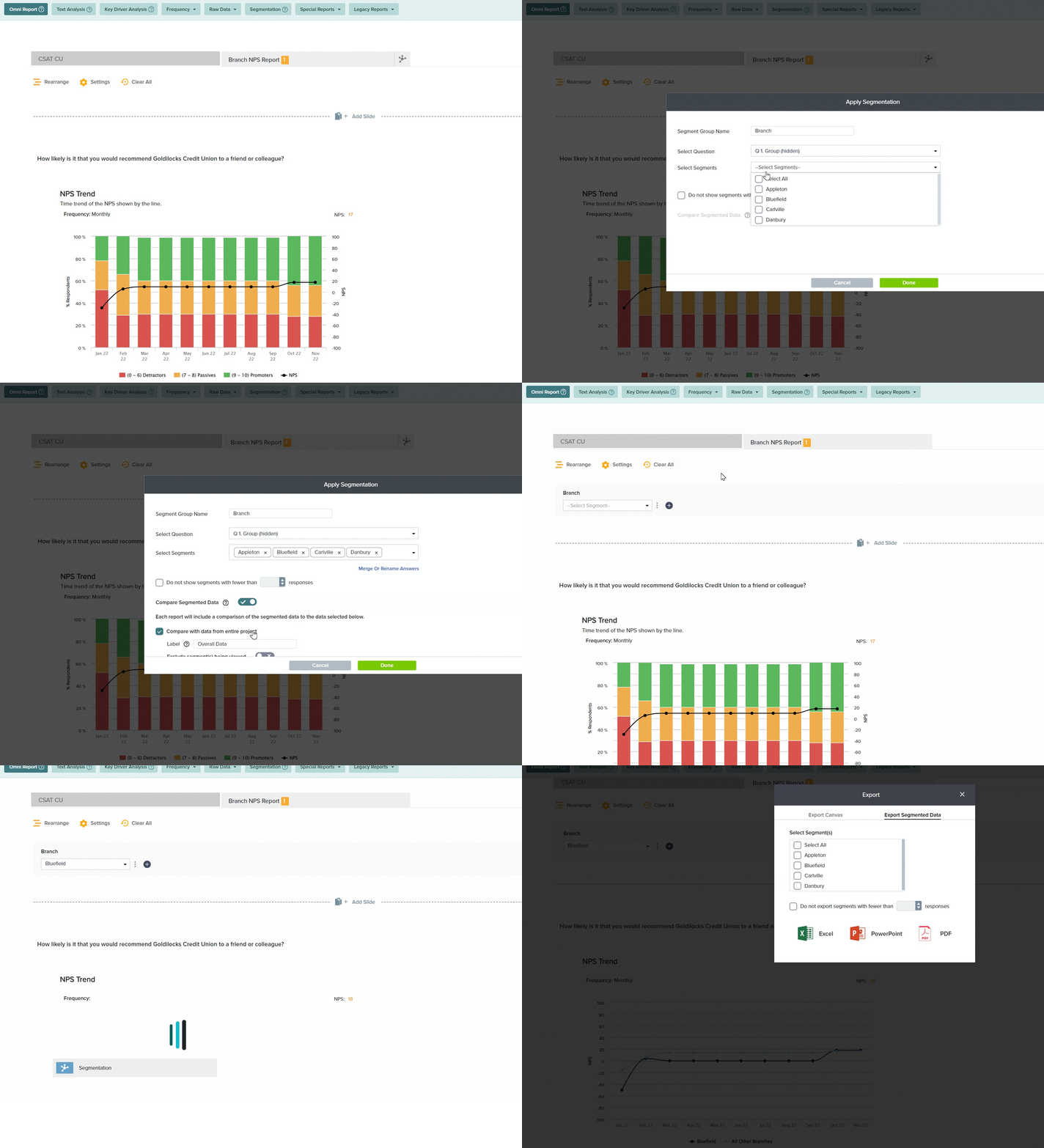
With that set-up, you know you’re about to hear about something dynamic! Dynamic Comparison is arguably the greatest thing since Report-Level Segmentation, so it’s fitting that the two work together. Here’s an example of the initial roll-out of this functionality.
You’re tracking member experience at a community credit union and you want to prepare reports for your branch managers to track how their NPS is stacking up against the other branches. Once you’ve prepped and added all of your report elements to the Canvas, you apply Report-Level Segmentation by branch. But wait — now there’s a new option! Choose to Compare Segmented Data with data from the entire project, then exclude the data from the segment being viewed. Once you’ve saved this setting, return to the Canvas and check it out. Pick one branch and see the comparison, then pick another branch and see a different comparison. Now, export or email those segmented reports, one to each branch manager, and they’ll all see their own branch compared to the other branches. Ta-da!

And a few more…
- ‘Clear answers on page’ disabled by default
- Updated branding in footer of participation pages
- Improvements to embedded surveys, pop-up surveys, and web intercept surveys
- Omni Trend graphs: Add cumulative, absolute data, and frequency changes for grid questions
- In-app NPS feedback collection
- Update to Excel export version in Sogolytics1 format
- Security update on Forgot Password page
- Minor updates to messages and UI to improve clarity and experience
Want more? Log in and see for yourself, then stay tuned — the next sprint is just around the corner and headed your way! 😉


