Hot on the heels of Score More: Weighted Scores, this entry is all about Net Intent.
Net Intent lets you quantify the overall sentiment of your responses. With Net Intent, you assign a positive, neutral, or negative sentiment to each answer option on a rating question type. The percent of negative responses is subtracted from the percent of positive responses, and you get a number between -100 and 100 that represents the overall sentiment of your participants.
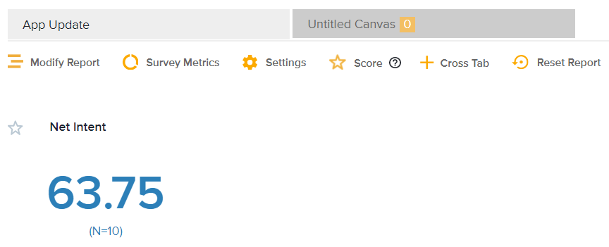
Choosing Net Intent
Let’s say I work for a credit union that recently made major changes to our mobile banking app. We want to see how our members feel about the updated app and its features.
Net Intent will let us know how positively (or negatively) our members view the update.
Setting it up
Once I’ve sent out my feedback survey and received responses, it’s time to employ Net Intent.
Net Intent can be displayed in the Omni Report at the top of the page under Scores. Once in Scores, switch the Score Type dropdown from Weighted Score to Net Intent. An options wheel will pop up to the right of the dropdown.
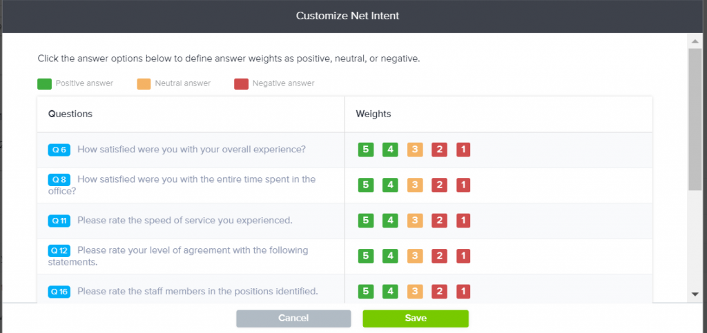
Click the options wheel to customize which answer options are positive, negative, neutral. For my purpose, I’d label all ratings of a 4 or 5 as positive, 3 as neutral, and 1 or 2 as negative. You could change this depending on your rating scales and use cases. When you’re happy with your customization, click save.
Now, enter a description of the score and select if you would like to view the score at the beginning or end of the report. I’d label it Net Intent and choose to display it at the beginning of the report so it’s front and center and easily identifiable.
Next, choose how you would like the score to be calculated and which questions you want to include. To keep it basic, I’d choose Overall Score and include all questions so I could see an overview of how our members view the app update.
The Net Intent score can be shown as either a number (as seen above) or as a graph (as shown below).
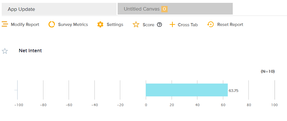
Breaking it down
If you’re looking to see the Net Intent score in more detail, there are a few different ways to view this data.
One way to view the data differently is by selecting to calculate the score in a different way. In the above example, I used Overall Score, but you could also choose Question Scores or Grouped Question Scores.
Question Scores shows you the Net Intent Score for each question.
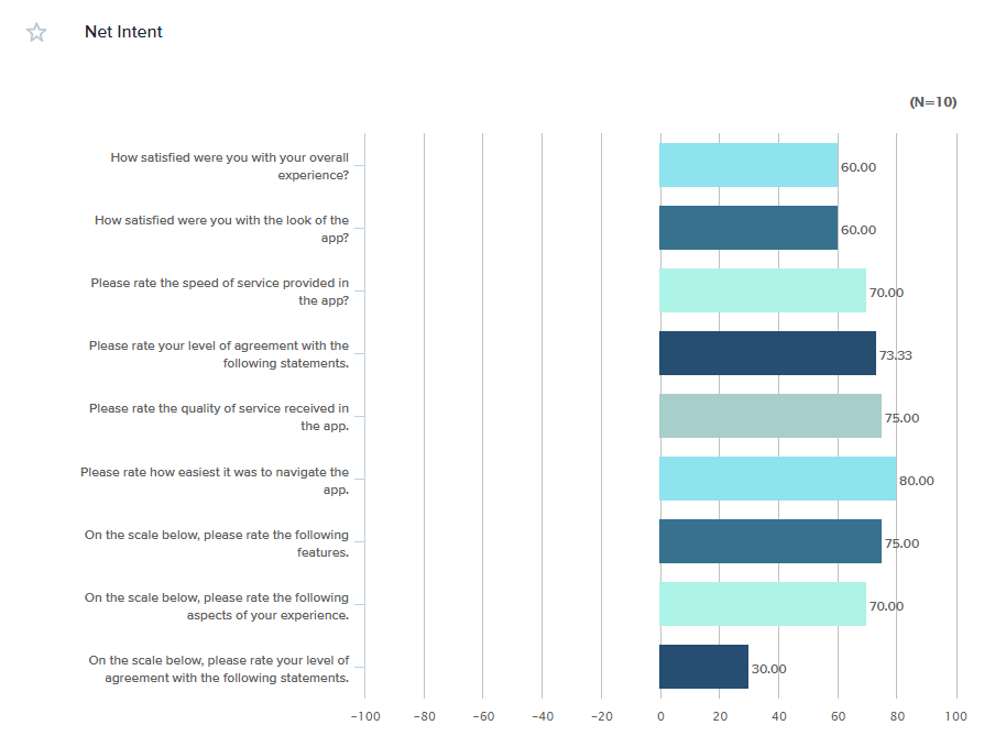
Grouped Question Scores shows you the Net Intent scores for, well, groups of questions. For example, you could use this to see the combined score of questions 1,3, and 7 compared to the combined score of questions 2, 4, and 5.

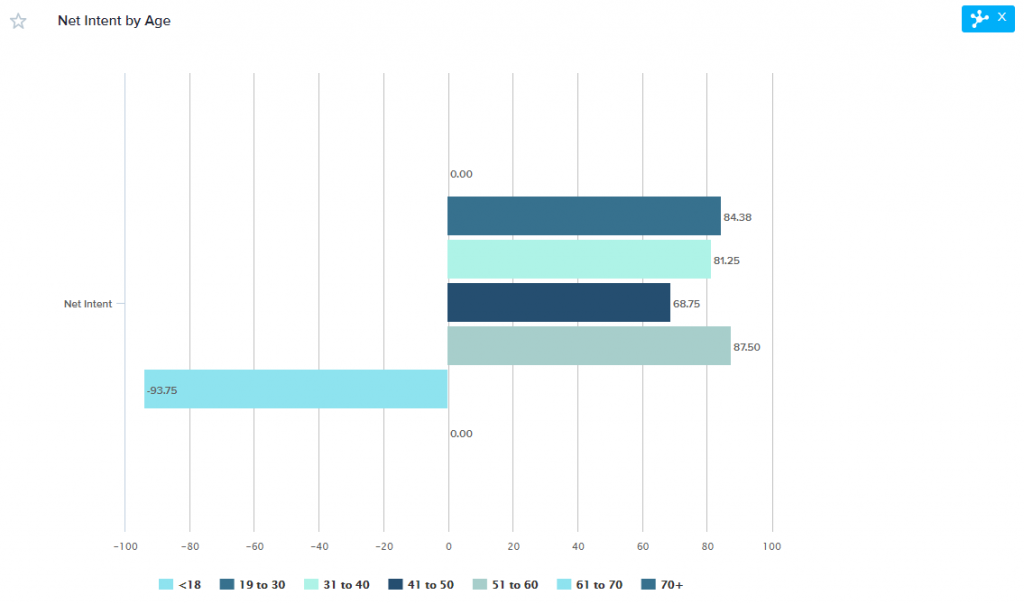
Lastly, you could use Segmentation to compare slices of your responses to each other. For example, I could segment the Net Intent Score in my survey by age group if I wanted to see how different generations viewed my app.
Learn more!
Keep an eye out for the final installment of Score More on Percent Favorable. In the meantime, be sure to give Score More: Weighted Scores a read through, and check out the User Guide pages on scoring and Omni display options for more information.


