One powerful way to gain insight from your surveys is to cross-tabulate the data. Doing so lets you discover correlations that aren’t obvious from a basic report.
“Say you were standing with one foot in the oven and one foot in an ice bucket,” said Bobby Bragan. “According to the percentage people, you should be perfectly comfortable.”
Basic survey reports can provide overall knowledge: this percentage of users is satisfied with their customer support resolution, or that percentage rank our product as best-in-class. But so much valuable information can be buried in the details!
For instance, your customers in the southeast might be thrilled with their purchase experience, but people in the northeast could have a horrible rating. If that were the case, you’d want to investigate what’s going wrong in the northeast region, instead of mistakenly working on the assumption that people are happy overall.
One way to analyze your survey data in more depth is to cross-tabulate it. That is, you compare the results in a table that shows the answers to more than one question. Even if you are new to conducting surveys and analyzing the data, you surely are familiar with the concept from basic spreadsheet use:
| Item sold | Northeast | Southeast | Northwest | Southwest | Total |
| Turbo widget | 14 | 6 | 25 | 12 | 57 |
| Basic widget | 16 | 73 | 25 | 6 | 120 |
| Enterprise widget | 52 | 11 | 5 | 34 | 102 |
| Total | 82 | 90 | 55 | 52 | 279 |
So: Cross-tabulation – available in Sogolytics Plus and above – lets you look at survey results in a similar way, by breaking down the information based on categories established from other questions’ answers. Here’s an introduction to how it works.
Let’s say you’re trying to decide whether your company should hold an in-person conference. It’s a no-brainer to ask customers about their interest, to find out how long they’d expect such an event to last, and to learn which locations are most appealing.
The overall results are the most important; if only 10% would show up for a conference, the details are a moot point. However, it is likely that you care most intensely about the preferences of the people who say, “I absolutely would attend!” because they’re most committed to the event.
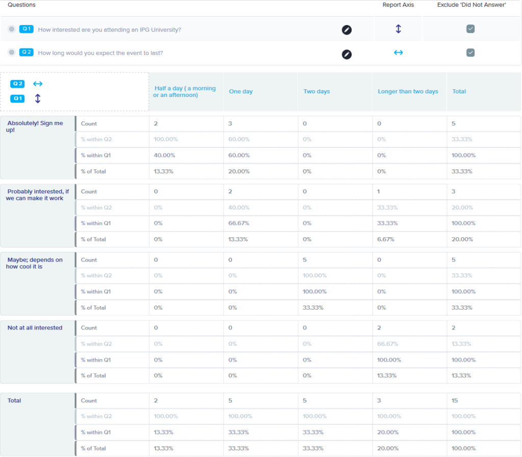
Thus, to use a simple example, you want to end up with a table that cross-tabulates customers’ attendance plans with the expected event length. In this case, there’s a correlation between attendance plans and how long the conference lasts. With “enough” attendees, you can justify a two-day event rather than a single day.
At least, it works as a good “how to” for the process of creating a simple cross-tabulation report.
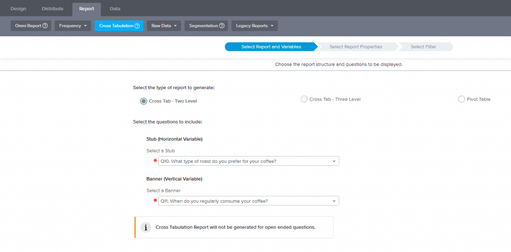
From the main Sogolytics page, choose Reports, then select the survey to analyze. From the drop-down menu select Cross Tabulation.

The first step in the three-step process is to identify which two questions Sogolytics should use in the comparison. You can choose any question type except open-ended text. (It’s possible to compare three questions, but I’m keeping it simple.)
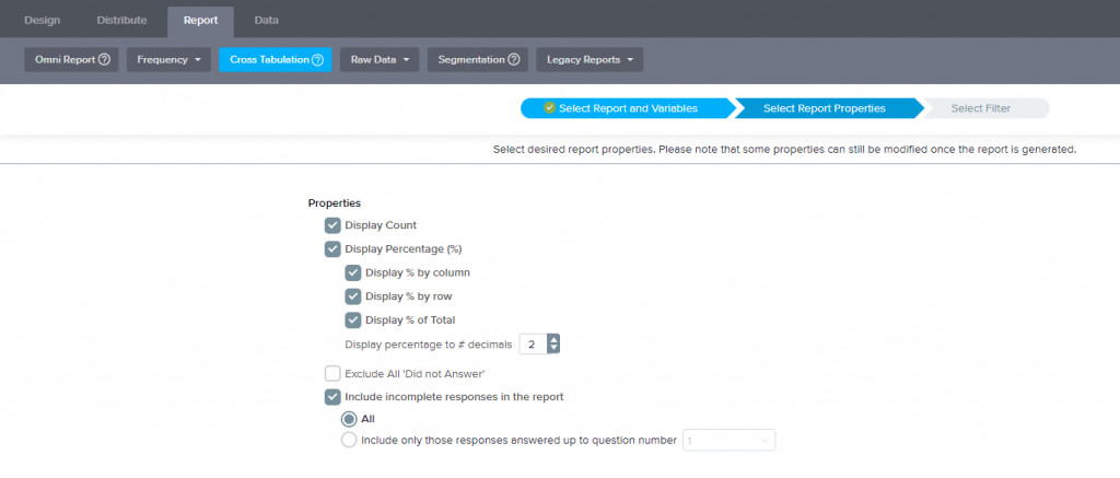
Choose Next to set the next set of options. Or you can jump to the results and take the default settings for the report. That’s useful when you’re poking at the numbers to determine for yourself if there’s a correlation; if the results generate an “Aha!” you can go back to optimize the report before you share it with other people.

The cross tab report can show data as percentages (34%), number of responses (18 said yes), or both. You can also decide whether to include categories for “did not answer” (which sometimes is meaningful, but also may be a distraction). You optionally can include survey data for respondents who did not complete the survey.

You can filter the data beyond the overall comparison. For this example, that might matter if you care whether the enthusiastic event respondents’ opinions are affected by their geography. So you might limit the cross tabulation report to customers who live only in the northeast, since you’re already sort-of-planning to hold the conference in Washington DC.

…And there’s a report! If you stick with the defaults, the displayed report might have more than you need to see; sometimes it’s confusing to see all those “percents.” But you can turn options on-and-off in the Report Properties section at the top of the screen to further refine what’s shown – including a stacked vertical or stacked horizontal graph.
Assuming that the cross- tabulation gives you some level of enlightenment – I admit this one is more illustrative than exciting – you may want to share the results with other people. Sogolytics makes that easy, permitting you to email the report or to save the file as a Word or Excel file.
You can do more with cross-tabulation, such as adding another question to the comparison. But I think this shows adequately how the feature works, and I hope it inspires you to experiment a little more with your data analysis.


