It’s time to take the next step — but in which direction?
Across the country and around the world, businesses are deciding how to reopen, schools are discussing back-to-school plans, and families and individuals are making choices about how and when to visit each other, to respect mask and distancing guidelines, and to create another normal.
In the first part of this series, we shared some high-level results of a small study on “Vax, Masks, and The Space Between” — a look at how some Americans were feeling as the CDC repealed requirements for vaccinated individuals. At a high level, some observations were obvious. At a closer level, we’re able to gather more specific insights — exactly the kinds of information you need when making decisions.
In this part of our series, we’ll dive in from the high-level Omni Report view to examine how to drill down on ratings, to highlight specific details through segmentation and filtering, and to bring key elements together in Cross Tabs. (If you need a refresher of the complete report, start with part one — here, we’ll just be focusing on specific slices. If you really just want to focus on pretty data visualization and sharing your results with the world, that’s coming up in the next part of the series — stay tuned!)

Rating questions get top marks
Any time you’re providing answer options on a scale, be sure you’re using a rating question. Whether or not your participants actually see the numbers, collecting weights on the back end allows you to choose the best way to present your results. An example: The question about how likely participants are to wear a mask in the next few days was a Rating Scale question. By default, results are displayed in a bar graph format, like this.
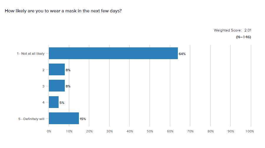
A bar graph is a great starting point — and for some questions, this may be the ideal data visualization. For a rating question, though, everything is relative. How high is the overall rating? Depending on your preferences, you may choose to display the breakdown by:
- Percentage for each answer option
- Weighted Score — the mean or average, in this case 2.01 on a 1-5 scale
- Net Intent — calculated by subtracting the percentage of negative ratings (1,2) from the positive ratings (4,5)
- Percent Favorable — calculated by adding up only the percentage of positive ratings (4,5)
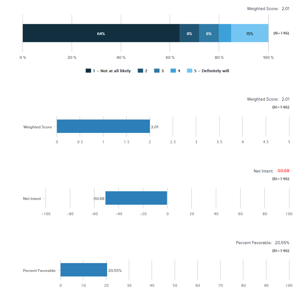
Is one of these the “right” way to display the answer to a rating question? Not necessarily, but you’ll find that it’s easier to make quick comparisons between questions and groups when you simplify the display. Choose the option that makes the most sense and use it consistently across different questions so your audience can understand quickly and make informed comparisons.
Segment and Score
One of the many benefits of using multiple rating questions in a survey is that you’re able to make quick comparisons. Whether you’re comparing questions, groups of questions, or even participant groups, both overall Omni Score options and Segmentation in Omni can pack plenty of power.
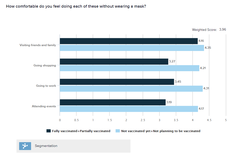
Here’s an example of how segmentation can offer deeper insights into the question about participants’ comfort level in participating in certain activities without a mask. You’ll note the base question here is a grid question, that each sub-question is displayed by Weighted Score, and that the segments are made up of merged sets — Fully and Partially vaccinated participants in one group and Not yet or Not planning to be vaccinated in the other group. This breakdown makes it easier to see who’s who.
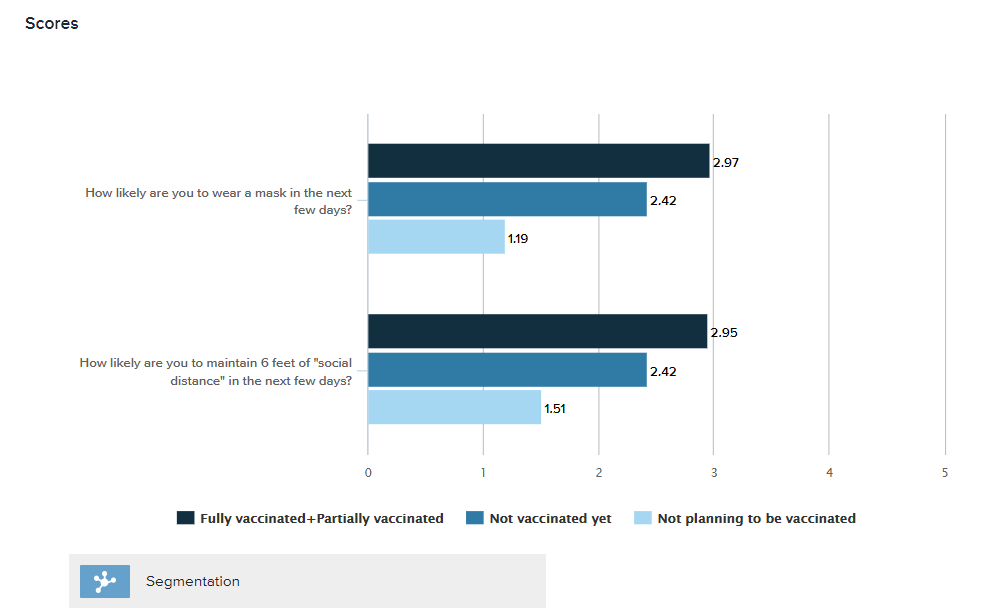
You can also make this kind of comparison between questions through the Score option in Omni. In this example, you’ll see segmentation across two different questions — about wearing masks and maintaining distance.
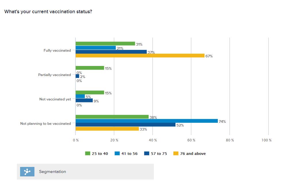
Of course, you can also use segmentation on questions other than rating questions, too. Here’s a look at the breakdown of vaccination status by age group. Don’t like this view? Flip it! One of the great things about segmentation in Omni is that it’s easy to create the reverse display — for example, breaking down age group by vaccination status instead of breaking down vaccination status by age. The point is simply to display responses in the manner that will be easiest for your audience to understand.
Cross Tab
Ready to get fancy? Graphs can be great for at-a-glance overviews, but if you want to drill down deep into potential relationships between variables, the Cross Tab is powerful choice. You’re probably familiar with the basic version of this, with answers to one question appearing as columns and answer options to another appearing as rows. Now that you know all about rating and segmentation, check out this version below. Two demographic questions providing the “row” variables” and vaccination status provides the “column” variables. The percentages displayed indicate the likelihood that someone in that group plans to wear a mask — by percent favorable.
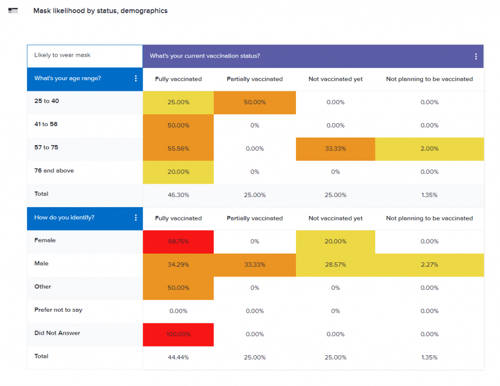
You’ll also see that this Cross Tab includes customized conditional formatting (often referred to as a heat map) to make it easier for the audience to see at a glance exactly where potential correlations might pop up.
Want more?
Slicing and dicing can help you to uncover fascinating insights in your data, but it can also be easy to get carried away. How many different ways do you really want to highlight your results? How many different ways does your audience really want to see the data? Options in the Omni Report make it easy to test out a variety of slices, then make decisions about where the most interesting data points really are and how best to display them so that your audience totally gets it.
Next up: Pretty reports that you can share with the world. In the meantime, if you need to drill down on your reports, book a training with our reporting experts!


