You’ve done the hard part of designing, distributing, and getting data for your project. Having finally made it to the reporting stage, however, you feel a little lost among the plethora of reporting options. Do you want a Frequency Report, Cross Tabulation, or maybe even one of the many reports hiding under the Legacy tab?
Sogolytics offers a variety of powerful reporting types to meet all of our users’ reporting needs — one of the many strengths that sets Sogolytics apart. However, if you didn’t start your project with a clear end report in mind, the number of options can seem quite overwhelming. For survey and assessment beginners, an overview report is a great place to start. Being able to see a high-level view of your data can be really helpful in allowing you to begin narrowing down the results you want to look at further—whether it’s open-ended questions, statistics, or comparisons.

The Power of Omni
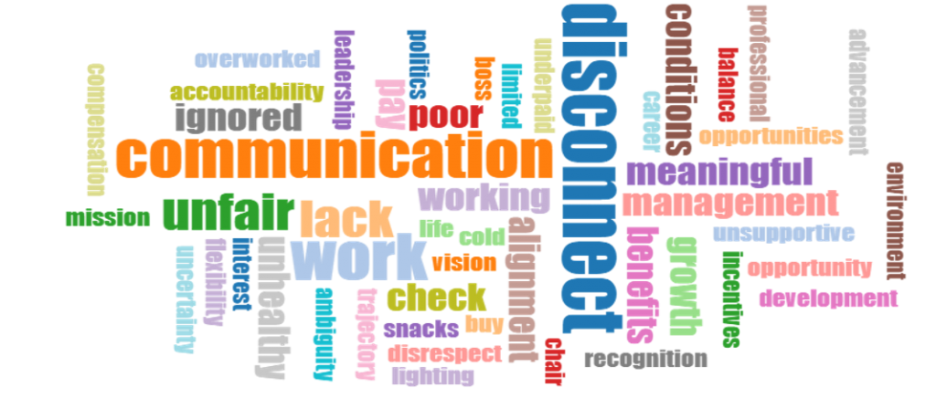
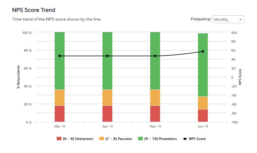
One unique report option that Sogolytics provides is the Omni Report. Right from the start, this report stands out from the rest. When you open Reports, you’re taken directly to an automatic Omni Report, rather than being asked to follow a generation wizard. Instead, your data is immediately put into bar graphs and word clouds, ready and waiting for your customization. Another aspect that sets Omni apart from its reporting brethren is how it merges the best of both worlds in terms of reporting power. If you’ve ever thought: “Wow, I wish there was a way to marry a high-level overview with detailed analysis capability in one report,” then this is the report for you!
The Workshop
Omni looks a little different than any of the rest of our reports. When you open Omni, a Default Report appears, listing every question in your project. The Default Report is your workshop, the place where you edit and tweak your data until it provides you with the most useful insights. In this Default Report, you’ll find all of your answers, including any open-ended text, as well as survey metrics and metadata. A comprehensive report that shows you all the data from your project in one place, the Omni Default offers a great overview. If you’re happy with the way everything looks and want all the questions to be included in your final report, you can go ahead and export right there. Options include a slideshow you can email or embed, a dynamic link to email, a saved version, or a download in Excel or PowerPoint.
The Default Omni Report is a great way to see all of your data, including the open-ended responses, in graphs, tables, and word clouds. Still, the true power of Omni lies in its emphasis on detail and customization.

Customization
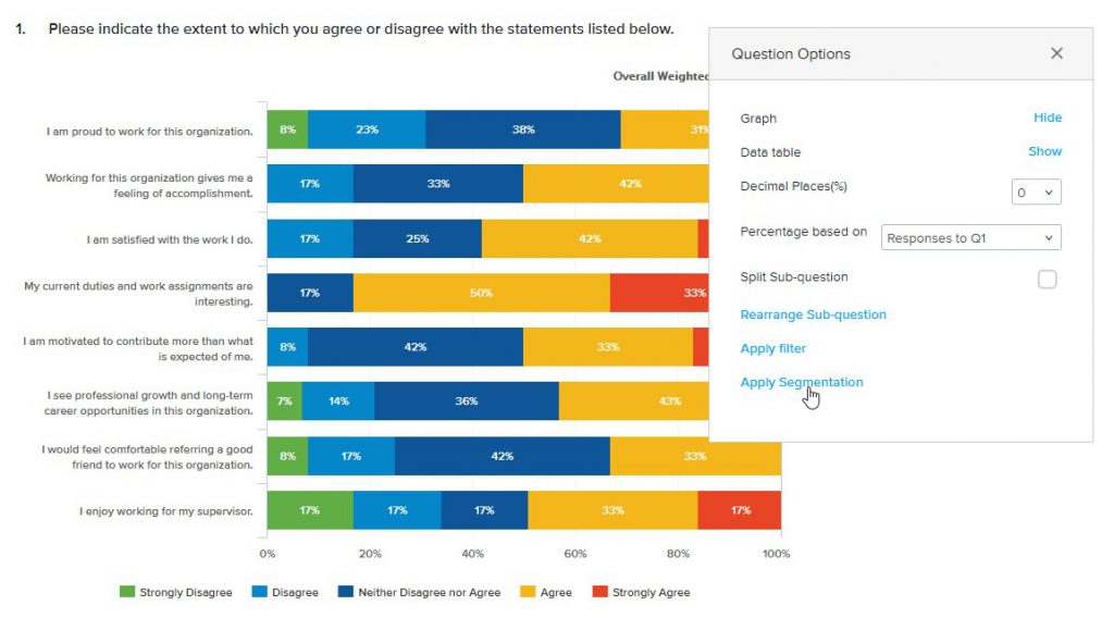
At the individual question level, three little vertical dots on the right side of the bar graph provide Answer Options, Customize Graph, and Add to Canvas options. Under Answer Options, answers can be merged, hidden, or deleted. The standard bar graph can be changed depending on the question type in regard to graph type, 3D, and coloring. Customization can also be done to word clouds by limiting the number of words, changing the word orientation, and even filtering words. Hovering over the three dots to to the right shows a menu with more question options. This menu has options to show or hide the graph or table. You can already tell that Omni gives you a lot of control over both data analysis and presentation.
Perhaps one of the more significant abilities of this report is how it pulls in other reports’ capabilities to filter and segment data. Under the Question Options menu, you can layer filters and segments on top of each other for a single question or all questions. Analyzing a question by narrowing insights through filters or segments or both, combined with the visual options offered in Omni, provide easily identified, powerful insights. When you’re finished with all the filtering and segmenting, a quick click of the refresh icon by the settings cogwheel will wipe all those edits clean so you can start over.

The Final Report
Once you’re done editing, filtering, and segmenting all that data, you have an option not found in any other report: To add that polished question to your Canvas. When you add to the Canvas, the other tab at the top of your report beside Default Report, you are essentially taking a screenshot of the entire data visualization generated for that question. Whether the question is a graph, table, word cloud, or open-ended answer card, you can copy it directly to your Canvas. As you discover new ways to segment and view your data, you can add multiple versions of the same question to your Canvas, building the perfect report for your purposes, question by question.
In the Canvas, you’ll find those three vertical dots again, offering further customization options like like adding footnotes, hiding the header or filter information, or removing the question from Canvas altogether. Don’t like the order in which questions appear on the Canvas? Rearrange the elements and adjust the Canvas settings to your heart’s content. When you’re ready, export the report as an Excel spreadsheet or PowerPoint deck or email the report as a dynamic link and voilà! One easy, customized, insightful, and actionable report: Done.
With all that capability you might say the all-in-one Omni Report is omnipotent. That ease of use and reporting power is right at your fingertips with Sogolytics. To learn more about how to set up your first — or next — Omni Report, check out this helpful User Guide article.


