In any interesting study, analyzing the results can go on and on and on. It’s like wandering through an amazing shop, picking up and examining interesting pieces as you go. In some shops, you might just be browsing. In other shops — and in every study — you eventually need to get what you came for.

In this third and final installment in our series breaking down the results of our study “Vax, Masks, and the Space Between”, we’re focusing on data visualization decisions and sharing results. If you missed the first two parts, you might start with the overview in part one — high-level results and displays by question type — and then continue on to focus on ratings, segmenting, and Cross Tabs in part two.
Data clean-up
When you start to review your data, you’ll sometimes notice that it’s a little untidy around the edges. For example, you might notice that there are a large number of people who did not answer a specific question. In that case, you might find that the display looks a bit awkward. What to do? In the Omni Report, there are multiple ways to customize answer option display.
Exclude Answers
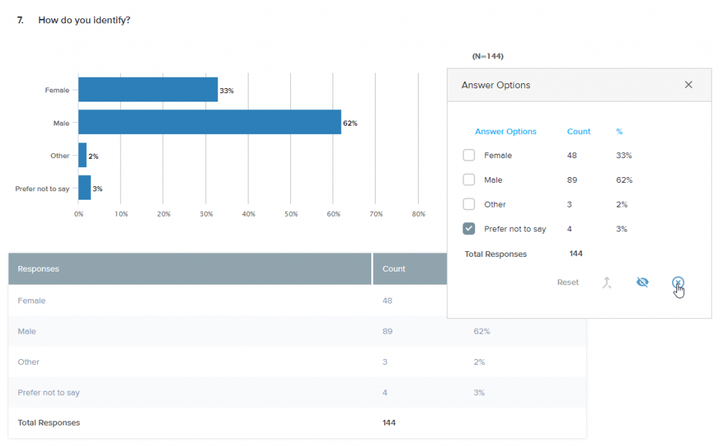
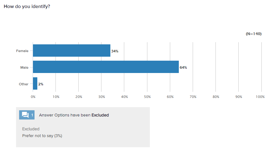
Consider excluding ‘Did Not Answer’ responses from your report. The same holds true for ‘Prefer not to say’. Is that answer option useful for your analysis? It might be, if you think you can learn more about your participants by the questions they chose not to answer. In some cases, though, it might make more sense to exclude.
Hide Answers
Keep in mind, though: If you choose to exclude an answer option, the totals will be recalculated. If you prefer, you may choose to hide the answer option, in which case there won’t be any recalculation. For complete transparency in your final report, it’s important to highlight these modifications in footnotes or other clarifications.
Merge Answers
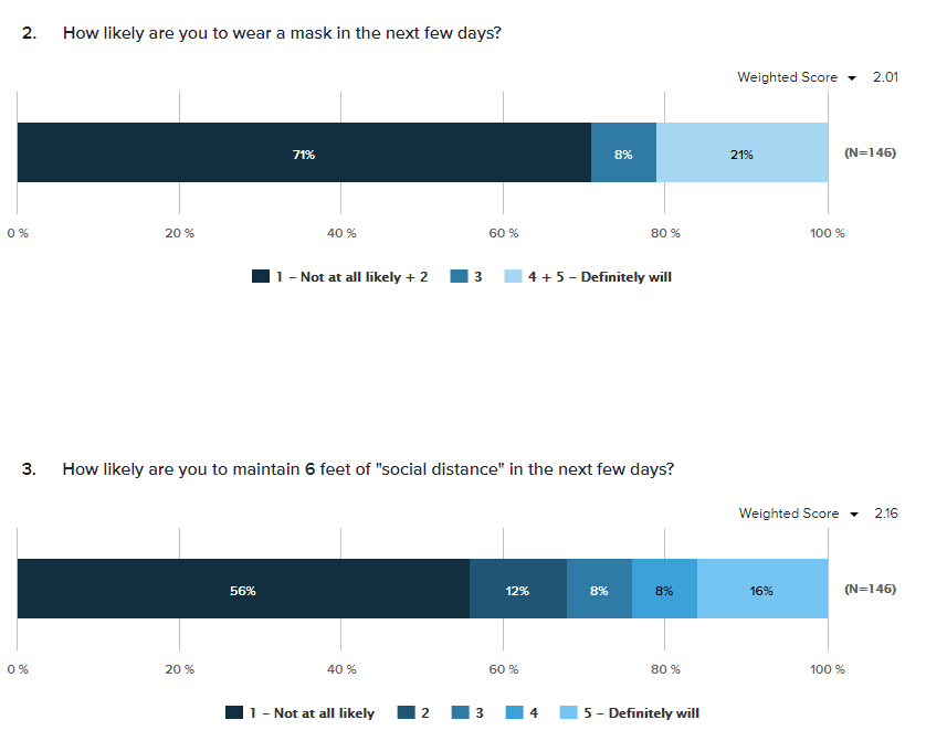
Another commonly used option that helps to tighten up your display is merging answers. Merging is commonly used when reporting on rating questions to highlight all positives together and all negatives together. This makes the result easier to read.
Sort Answers
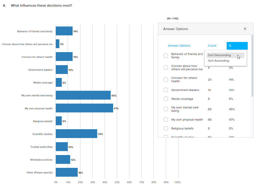
To make a longer list of answer options easier to review, you might consider sorting answers. While alphabetical order may make the most sense for participants responding to the question, it’s not as important for those viewing your report. Instead, choose to sort by descending or ascending order.
Customize the Color Palette
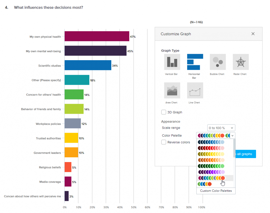
If you’re a big fan of the color blue (and who isn’t?), the default reports above might look pretty good to you. Depending on your audience and your goals, though, it may be important for you to display a different color palette to customize your graphs. Whether you need to match a corporate style guide or simply to provide better visibility and accessibility, you can choose from a set of default palettes or customize your own.
To follow up on the ‘Sort Answers’ example above, here’s the same question with the answers sorted and colors updated to one of the default color palettes — Multi.
Choose the Right Graph
Depending on your question type, you have a variety of data visualization options. There’s nothing wrong with a good old bar graph, but it’s not your only option!
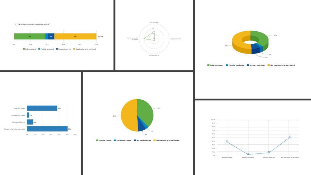
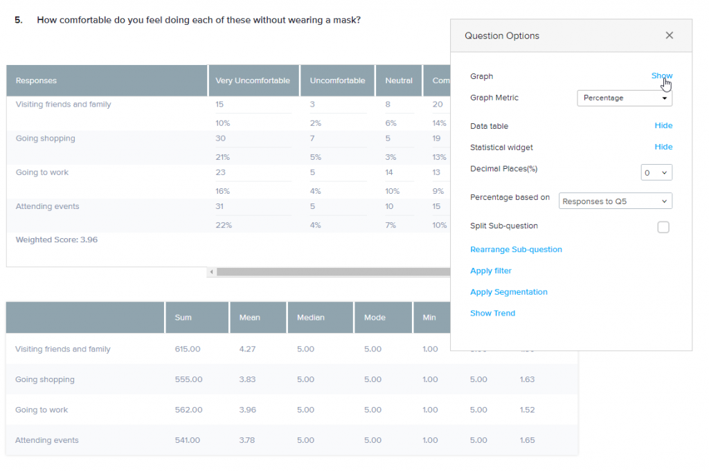
Switching between multiple types of graphs and color palettes can help you to highlight the story you want to tell with your data. Need tables, too? Get tables, too! Plus, depending on your question type, you add a statistical widget, a trend graph, or a Word Cloud.
Share Dynamic Reports
Ready to share a report while your project is live? Think before you share: If results are shared too widely while responses are still coming in, there’s a chance that you might bias future results. (For example: If you find out that everyone’s already voted for yellow but you want blue to win, you’re more likely to either respond again or try to influence others to go blue!) To reduce the risk, share only key results with a key number of team members.
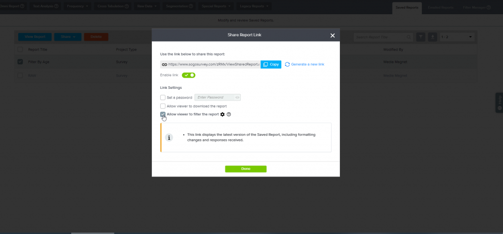
One more piece to consider: Should those viewing the report only see specific slices of your data? For example, maybe you’re sharing results with the head of the Client Success team so you want her to see only data relevant to that team. In this case, you might apply a filter before sharing results. In the case of this study, I might want to look at results by participant age range.
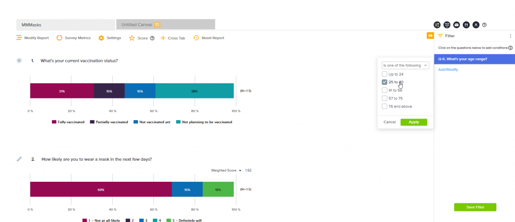
Once I finalize and save my report, I can email it directly to others or generate a dynamic link. The shared report will be updated as results come in. I can also choose to set a password, allow recipients to download results, and allow or block any modification of my saved filters.
Download Reports
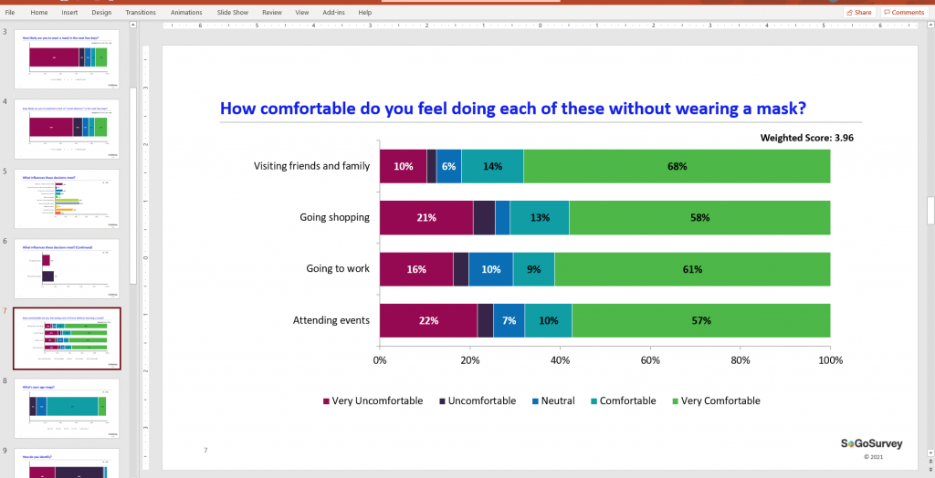
All wrapped up and ready to present a static report?Want a PowerPoint or Excel report right away? Get it. You’re downloading native graphs that can be modified as needed within their respective programs.
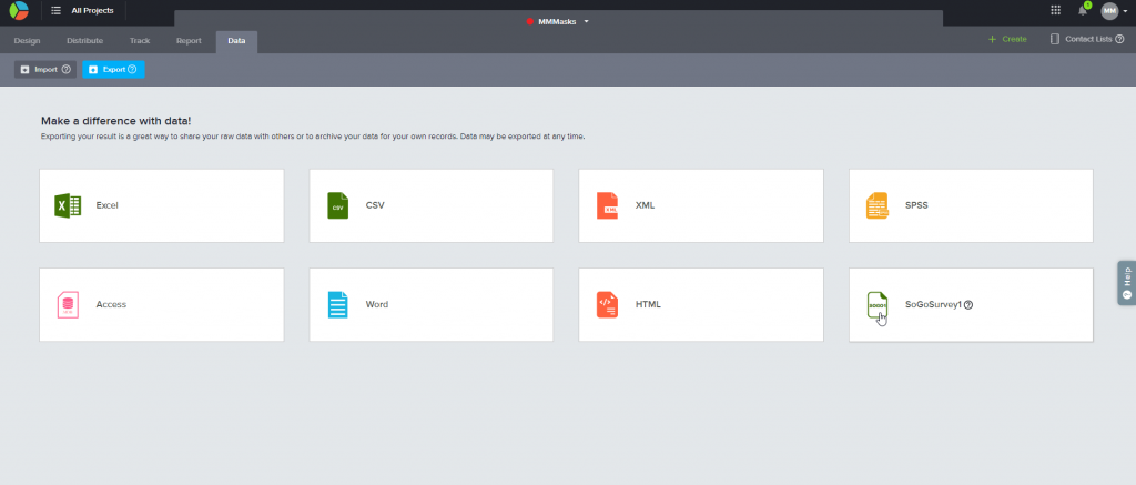
Want raw data? From the Data tab, export raw results in the format of your choice. If you’re planning to import back into our platform, use the Sogolytics1 format.
Ready to make the most of your results? Explore our User Guide! Not yet a Sogolytics user? Request a demo today!


