If I had a nickel for every time I saw these survey design mistakes, I’d have a lot of nickels.
From client onboardings to internal trainings, I’ve seen a lot of really smart people make a lot of really regrettable mistakes in their survey design. Unfortunately, mistakes at the beginning of the design process carry through the rest of the project, often resulting in useless results. Fortunately, nearly all of these mistakes are avoidable.
Ready for a crash course in Design Disaster Avoidance? Here’s Part 1:
Mistake 1: The purpose isn’t clear.
Why are you doing this project anyway? If you’re asking participants to commit their valuable time, make it worthwhile. Clearly identify your goals so that you can justify to your audience why they should bother to respond. What reports will your team want to see, and how will they use the results?
Do this: Clearly address the purpose of your project in the introduction — and invitation, if you’re sending an email — as well as any other related communication.

Mistake 2: The wrong question types are used.
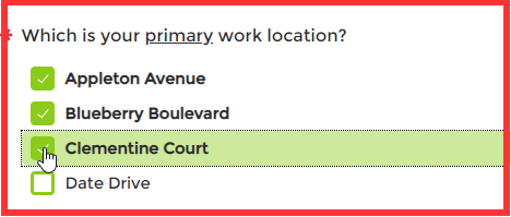
Even if you ask the right question, building it as the wrong question type means your results are probably wrong, too. If you’re asking for a single answer, use a Radio Button instead of a Check Box. If you’re asking about a degree or level, use any of our rating questions. If you want to segment your reports according to a single categorizing question, use a Radio Button or Drop Down rather than a Text Box. The list goes on.
Do this: Before you launch, try taking your survey or assessment as a “bad participant”. Instead of answering in exactly the way you want participants to respond, think of all the “wrong” ways they could respond. If you can set yourself up to collect only good data, do it.

Mistake 3: Too many questions are included.
Imagine you’re in a conversation that drags on and on way longer than seems necessary. Maybe someone’s pestering you with questions and you’re too polite to walk away, but if this keeps up, you’ll have no choice… If this happens in your survey, participants will simply drop out. Remember your purpose, then focus on the need-to-know and leave out the nice-to-have.
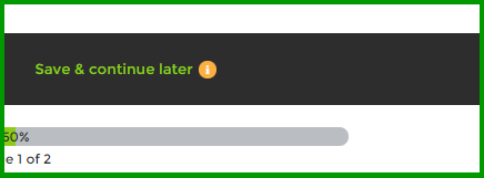
Do this: Ask others to test the survey. Don’t ask those who are too close to the topic — others who might be interested in those nice-to-have items, too. Reach out to other teams or individuals who can provide critical feedback. If you need to ask a good number of questions, make sure participants understand the value of their responses, set expectations up front, and enable Save and Continue Later.

Mistake 4: Every single question is mandatory. 
Sure, there’s a lot that you’d like to know — after all, that’s why you’re asking, right? Still, forcing participants to answer every single question is one of the leading causes of survey drop-out. In most cases, if you’re asking the right audience the right questions, they’ll have no problem answering. Once you start asking about sensitive topics, though, participants are more likely to question why you’re asking and how their data will be used. Keep in mind: Simply hiding the fact that questions are mandatory doesn’t solve this issue
Do this: First, identify the answers that are absolutely critical to your reports — in other words, your results would be useless without the data. For example, if you must divide customer feedback by product type, the product question should be mandatory. Next, if your project includes logic or piping, set decision or source questions as mandatory to ensure the right flow. Finally, if there are some questions that would really be helpful but aren’t critical, use Encouraged Response so that participants can skip if they really need to.
Mistake 5: Answer options are missing or poorly presented.
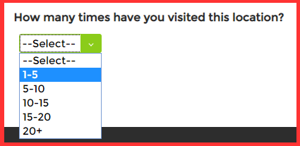
Especially if a question is set as mandatory, it’s absolutely critical to ensure that participants can answer. It goes without saying that all valid answers must be presented. Imagine receiving a survey with a question about work location and then finding that yours isn’t listed. Clearly not the way to engage participants. Is it possible that ‘Not applicable’ is the best response in some cases? Absolutely — ‘Neutral’ doesn’t mean the same thing, and leaving out the most appropriate response (N/A) can skew analysis. Additionally, check your ranges. If your ranges are 0-5, 5-10, and 10-15, which option should be selected for 5 or for 10?
Do this: Test, test, test. Rather than testing as a “bad participant”, test as a critic. If someone wanted to find fault with your answer options, what might they point to? If it’s your survey, it can be really difficult to see the gaps — after all, if you recognized them, you’d fix them. This is a good time to call for back-up from those critical friends again.


Design is one of the most exciting parts of the process, and because it’s easy to build a beautiful survey quickly, it can be tempting to launch right away. Still, taking the time to review your work and check for potential issues can save you plenty of potential headaches down the road.
Want more? Check out Part 2!


