Working from home? While some of your meetings may have transformed into emails, there’s a good chance that plenty of them are happening online.
As we practice social distancing, the COVID-19 crisis means more people than ever are participating in video conferences instead of in-person meetings. It’s easy to just turn on your webcam and start your meeting, but I’d consider treating the presentation that’s on your webcam the same as you would present yourself with a meeting in-person. Since social distancing and staying at home won’t be going away anytime soon, I thought I’d provide some advice about how to have your video conference presentation look professional.

Staying Eye Level
This sounds pretty straightforward, but it can make a bigger difference than many would initially think. In films, if the camera shot is looking down on the actor or subject, it makes the subject appear smaller and less powerful. The same goes for if the camera is looking up to an actor or subject: it makes that subject seem more strong and powerful. While video conferencing doesn’t involve the same analysis as a film does, looking down at the camera or up at the camera can have an effect on a person’s perception of your video conference. Therefore, do everything in your power to keep your camera eye-level. It’ll make eye contact easier and make the video conference seem a bit more conversational and even. It’s a small detail, but it is important and can affect how others perceive you (on a sub-conscious level if anything else). It’s difficult to have a regular table that will meet the computer’s webcam at eye-level, so experiment with your options. I set my computer on top of a small box and this works great.
Lighting
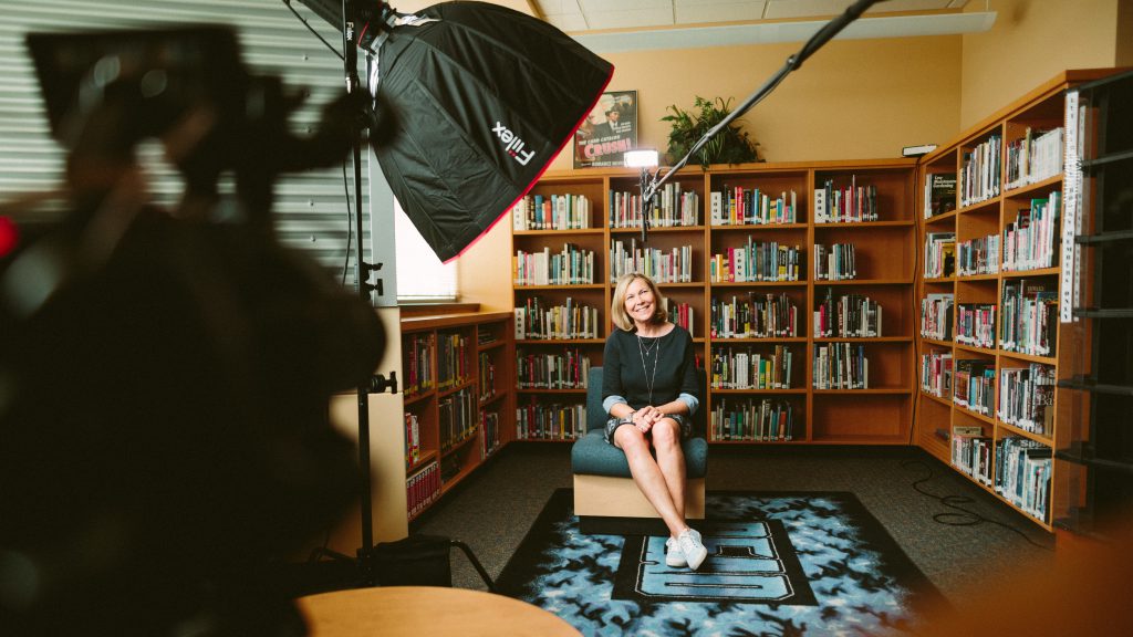
Lighting is one of the most important factors in films and entertainment because it can affect how a viewer perceives any subject, actor, or setting. Having more shadows on someone’s face makes them more mysterious, for example. On a professional video shoot, you’ll see numerous lighting rigs set up all over the place. Video conferencing when working from home won’t involve multiple lighting rigs and a full professional set up, but there are some small changes that you can make to improve the lighting of your presentation (even if you don’t have much light to begin with). The biggest thing that you shouldn’t do: sit in front of a bright window. It is distracting, and it’ll make people pay attention to the background more than you. Sunlight is a good tool for lighting, but having it directly behind you wouldn’t be utilizing it properly. Having the sun shining on you is a much better way to get some natural focus on you, even if the lighting might change here and there (depends on the clouds). It’s important to remember that the sun doesn’t run on anyone’s conference schedule, so the lighting will usually change and that can potentially be distracting. An overcast day is probably the most predictable type of sunlight to have to deal with: it won’t be the brightest, but will most likely give you even lighting. Either way, the sun is the most powerful light source anyone is ever going to get, so if you can utilize you might as well try!

Spacing
The space and orientation around you when you video conference can make it look more (or less) professional depending on what you do. Being in the center with even space on both sides of you will do wonders for how you look on a video conference call. On top of that, make sure you don’t have too much head room: the typical advice is to have three or four fingers worth of space between the top of your head and the top of the camera shot. I typically get a look at the shot and just eyeball my spacing, so you don’t need to get fancy with trying to make sure there’s even spacing on both sides of your screen. Even if you can’t fix your lighting or you can’t find something to help your camera get to eye-level, spacing and proper head space can make a significant difference despite not taking much time or resources.
You don’t have to do all of these, but incorporating one of these aspects will help improve how you present yourself when video conferencing.
Dynamic Background
For video conferencing, your camera is not going to be capturing high quality 4k video, and that is absolutely fine! Even with a camera that isn’t going to capture the best video, having a dynamic background is great because it creates a deeper and more engaging image. A dynamic background shouldn’t be distracting, but it should enhance the image and bring more focus to you. One of the easiest things to do to make your background a bit more dynamic (and less flat) is to avoid sitting directly in front of a blank wall. A person in front of a blank white wall is a boring image, and while there are no distractions, it isn’t visually engaging. Sitting slightly away from the wall and allowing space between yourself and the background can create depth and improve the viewer’s engagement. Even if you can’t get much depth, consider a background that includes a pattern or lines that direct attention to the center of the screen. Personally, I use my curtains as a dynamic background — they offer a little interest and depth and help separate me from the wall. For my videos on YouTube, I’ve used a colorful painting that adds some flavor to the screen and also includes lines that trace right down to the center of the screen (where I am, of course!).
You don’t have to take drastic steps to improve your WFH calls, but incorporating one or more of these ideas will help improve how you present yourself when video conferencing. I can’t follow all of these steps all the time, either, but whenever I have an opportunity I try to consider these suggestions before I go into a video conference. And even if you can’t incorporate anything, I encourage everyone to try and show your face on as many video conferences as possible! In these isolating times, it’s good to see each other and have some face-to face-conversations — even if they’re virtual. Also, if you are looking for more information about working from home, I’d recommend reading this and this.


